Data Maps to Guide Your Ecommerce Journey
Track crucial metrics that native ecommerce platforms can’t with our proprietary analysis tool.
Join Statlas
by Common Thread Collective
Jan. 24 2024
Welcome to Statlas Jam Episode 4!
If you’ve missed the earlier episodes in this series, you can catch them all here, on our Statlas Jams YouTube playlist.
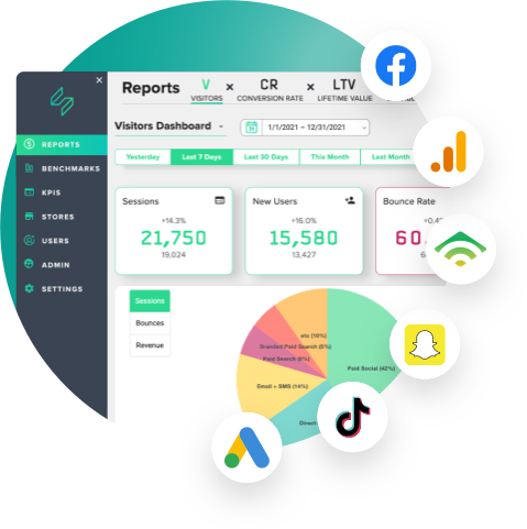
In this episode, we dive into the art of designing the perfect dashboard. Dashboards come in countless variations — Daasity has one, Google Data Studio has one, and so on. In fact, many of you build your own, and I think it's awesome. We all love to think about the right way to prioritize information.
But what makes a dashboard truly effective?
Join us as we explore the design principles that shaped the Statlas homepage dashboard.
At the core of a great dashboard is a clear hierarchy of information.
Scale, placement, and color all play a huge role in setting up a proper hierarchy of information.
Learn how prioritizing the most critical metrics at the very top, in a larger tile, acts as the scoreboard defining success and guiding your organization's focus.
Uncover the common flaw in many dashboards — lack of context.
Discover how placing data in the context of expectation, a fundamental concept behind Statlas, enables quick insights.
Daily forecasting metrics are at the core of Statlas. It's about the ability to look at data in the future and as well as the past, because you always have an expectation for every number.
See at a glance whether you're ahead or behind targets, with immediate visibility into performance against expectations.
A key feature of a powerful dashboard is the ability to dive deeper into each metric. Inside Statlas is no different, with each tile acting as a doorway.
Explore how each data point serves as a doorway to deeper analysis, allowing you to gain valuable insights into specific channel performance. Whether it's the Facebook overview report or an AOV histogram, every tile opens the door to a more profound understanding.
Embrace the challenge of turning raw data into a compelling, insightful, and actionable dashboard.
These three essential features—Hierarchy of Information, Data in Context of Expectation, and Doorways to Deeper Analysis—are the building blocks of an effective dashboard.
Whether you're creating your own dashboard, or interested in using the Statlas dashboard discussed in this episode, let us know!
Enhance your dashboard design and make data-driven decisions with confidence.
Track crucial metrics that native ecommerce platforms can’t with our proprietary analysis tool.
Join StatlasCommon Thread Collective is the leading source of strategy and insight serving DTC ecommerce businesses. From agency services to educational resources for eccomerce leaders and marketers, CTC is committed to helping you do your job better.
For more content like this, sign up for our newsletter, listen to our podcast, or follow us on YouTube or Twitter.